Abound is changing how people approach loans by removing the usual barriers and confusion. Instead of making borrowers jump through endless hoops, Abound focuses on speed, flexibility, and genuine accessibility. The aim is to provide affordable loans without overwhelming applicants, offering a simpler, more human perspective on lending.
Borrowers often face a confusing maze of steps, vague timelines, and unclear requirements when applying for a loan. This uncertainty creates anxiety and leaves users feeling lost. We needed a way to lift the fog: to show them what’s happening behind the scenes, explain what’s needed and why, and give them gentle guidance that builds confidence instead of suspicion.
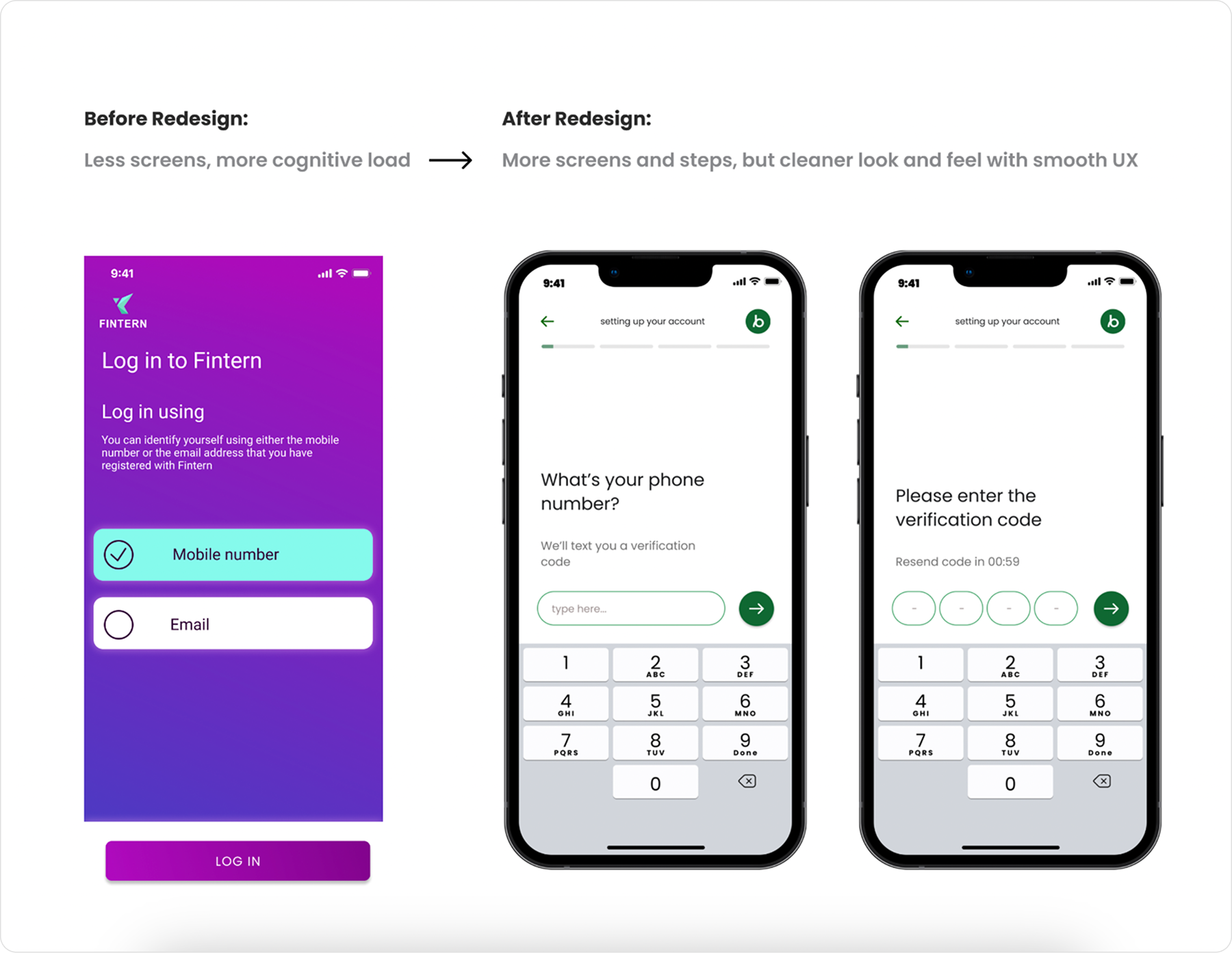
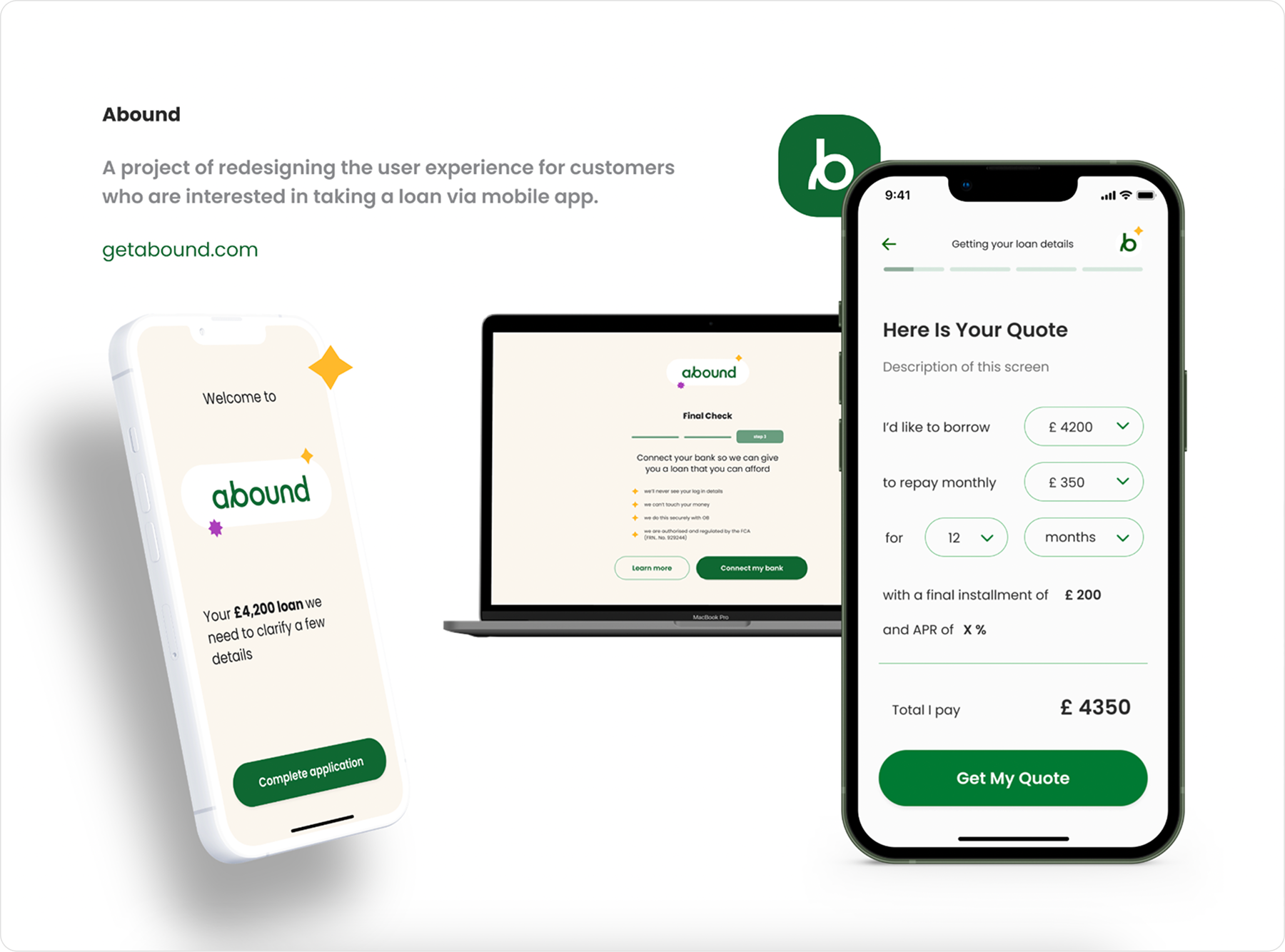
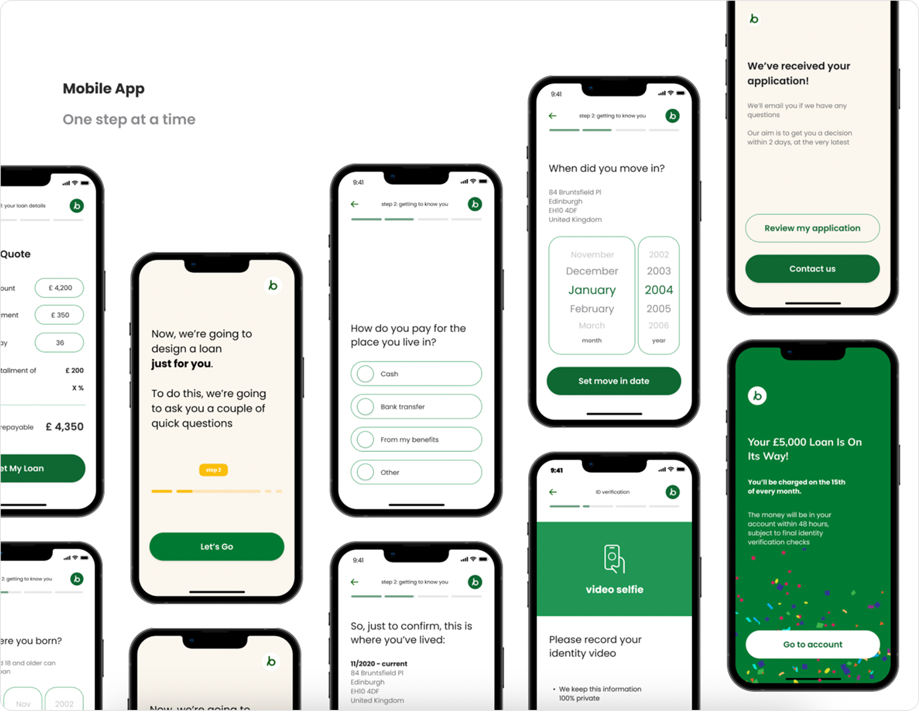
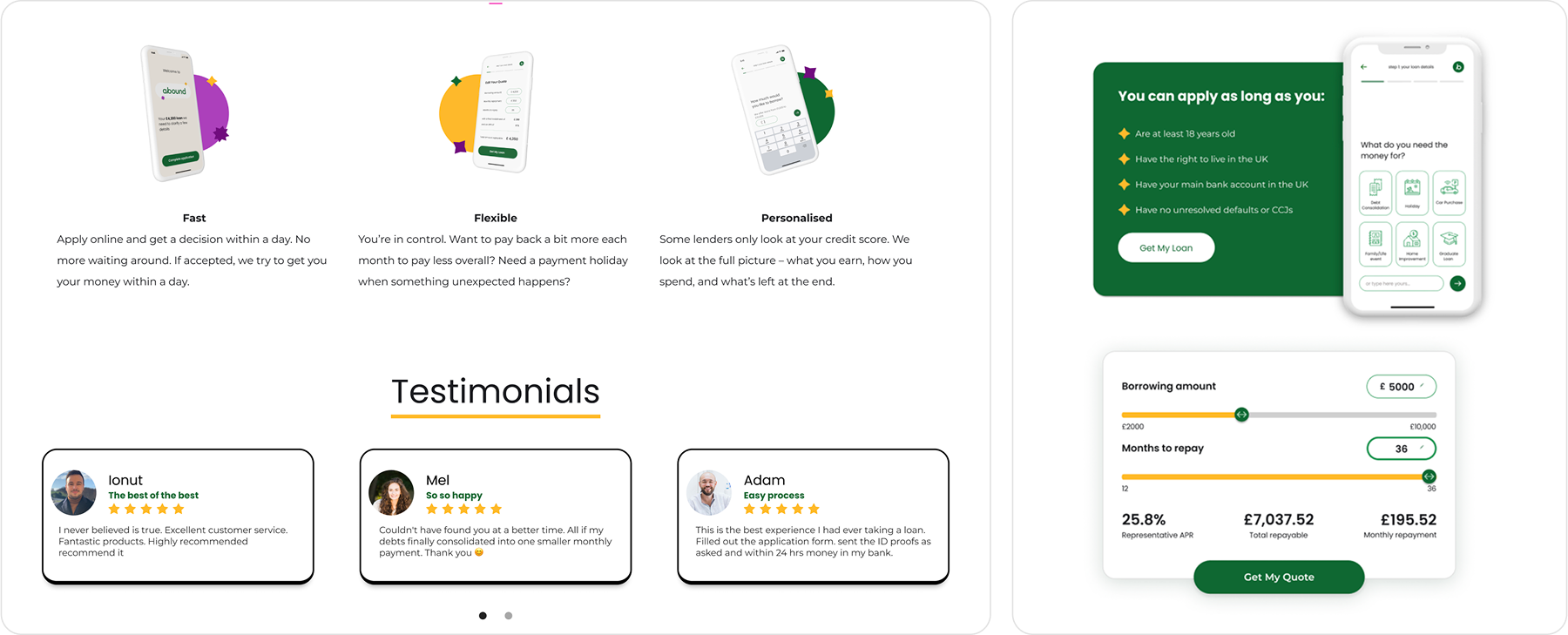
To address these concerns, we stripped the interface down to its essentials. Instead of burying important details under layers of complexity, we presented each stage of the application as its own clear milestone. Progress indicators, simple language, and straightforward visuals helped users track where they were in the process. By making things feel lighter, more open, and less intimidating, we replaced uncertainty with a sense of calm progress.
It all started with open, honest conversations with Abound’s team, who knew their users well. By understanding exactly where people stumbled or hesitated, we identified which steps required clearer instructions and which bits of information could wait until later. This careful planning shaped the information architecture, ensuring that users encountered details at the right moments rather than all at once.
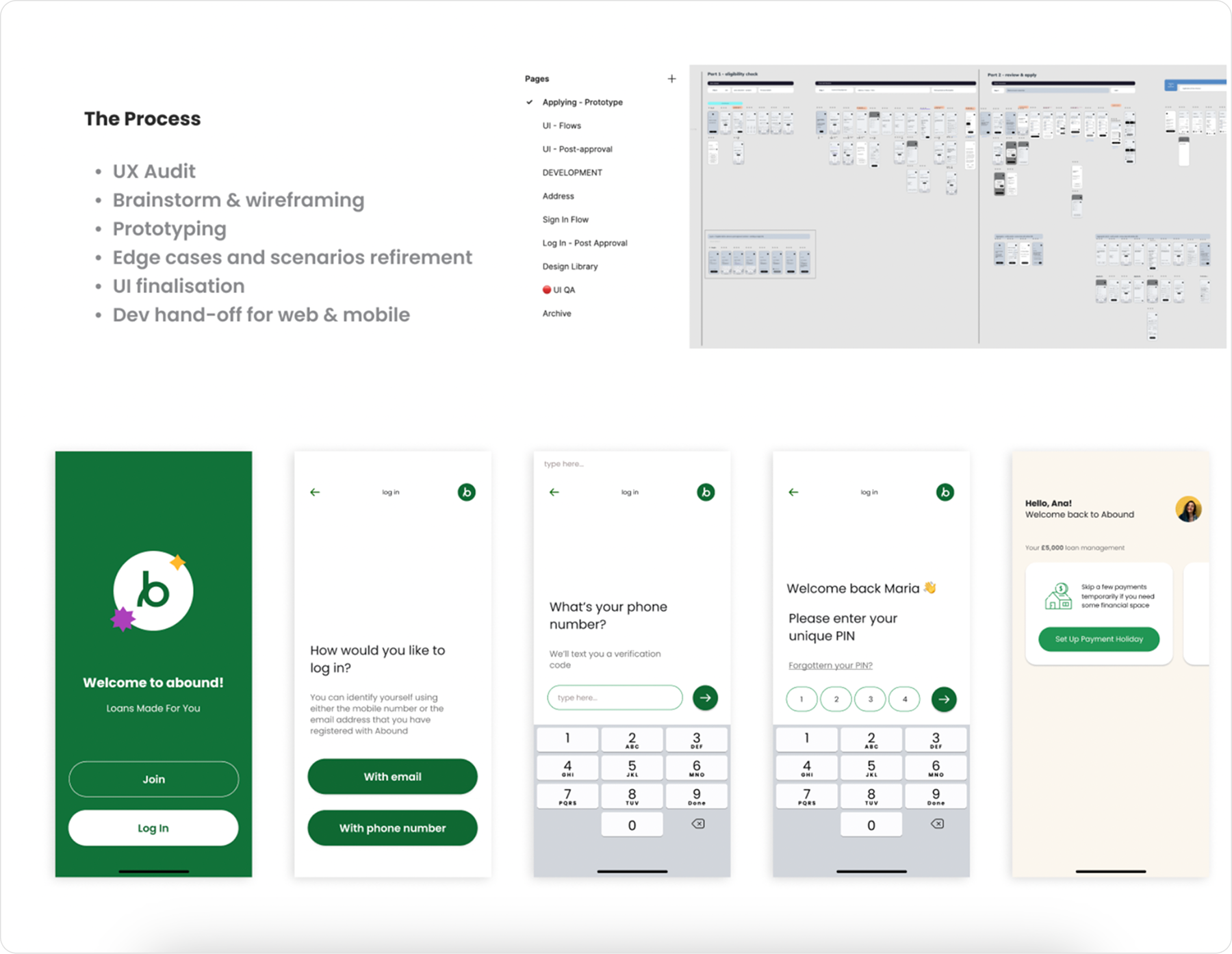
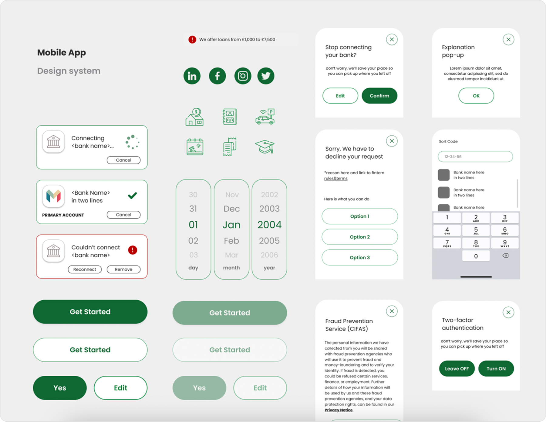
With a solid structure in place, we focused on refining the look and feel. We established a design system that tied every component together, making sure each screen felt like part of a unified whole.
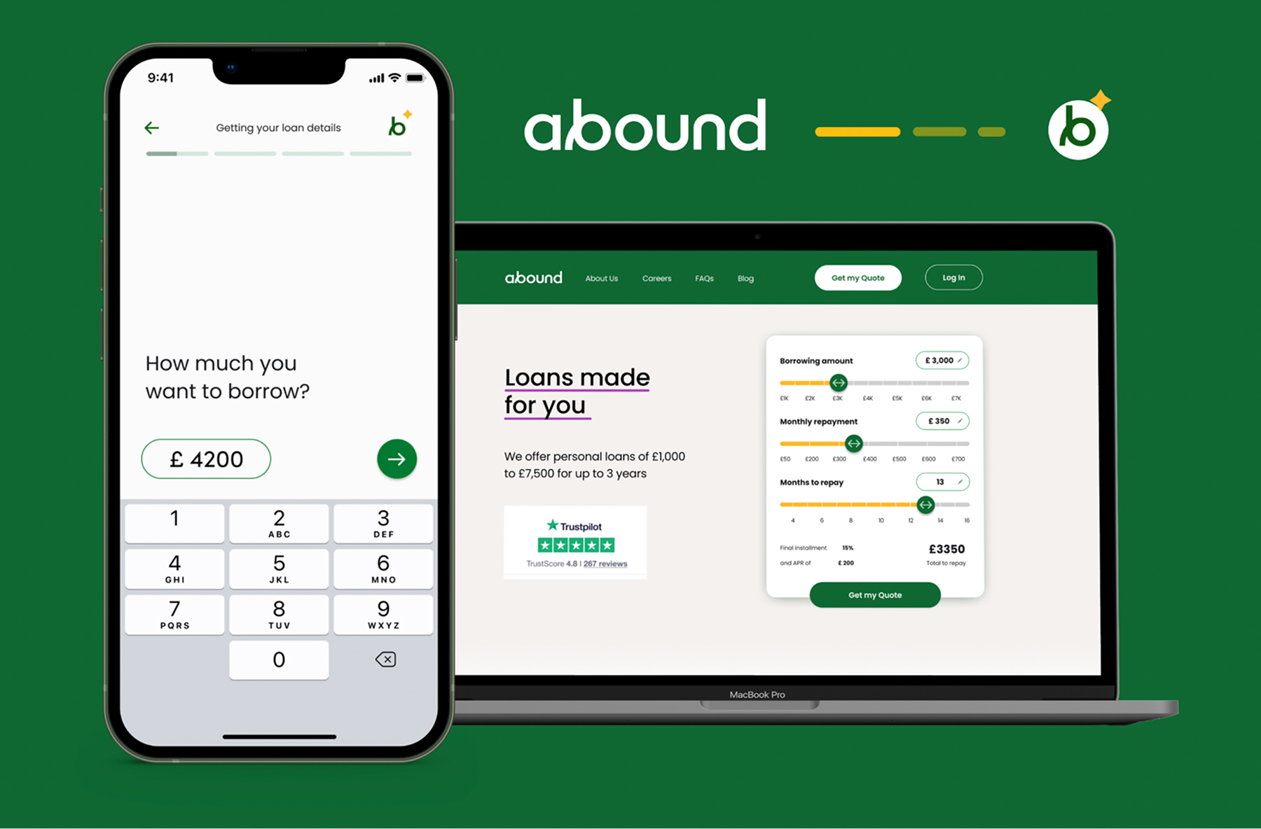
While crafting this system, I also redesigned the landing page, ensuring it embraced the same clear and approachable principles. This sense of continuity helped reduce the user’s cognitive load. From landing page to final approval, the experience felt consistent, intentional, and transparent, reinforcing the trust we aimed to build.
By turning a complex journey into clear, step-by-step guidance, users felt more confident and understood what was happening at every stage. This human touch not only made the product more approachable, it also set the groundwork for Abound to continue adapting over time. In the end, the redesign set a new baseline for what a lending experience could be: more honest, more understandable, and ultimately more empowering for people.


.jpg)