.png)
Georgian Public Broadcaster (GPB) is Georgia's largest traditional media network, operating TV and radio with 2,500+ employees. They set out to build a VOD streaming platform the first of its kind in Georgia.
The core challenge was making the platform accessible and desirable to a younger demographic without alienating older users. Engagement metrics on the existing news site (1tv.ge) were declining users cited poor navigation, dated visual language, and friction in finding relevant content.To ground the platform in real user needs, we kicked off extensive primary and secondary research, both internally with editorial stakeholders and externally across our target audience segments.
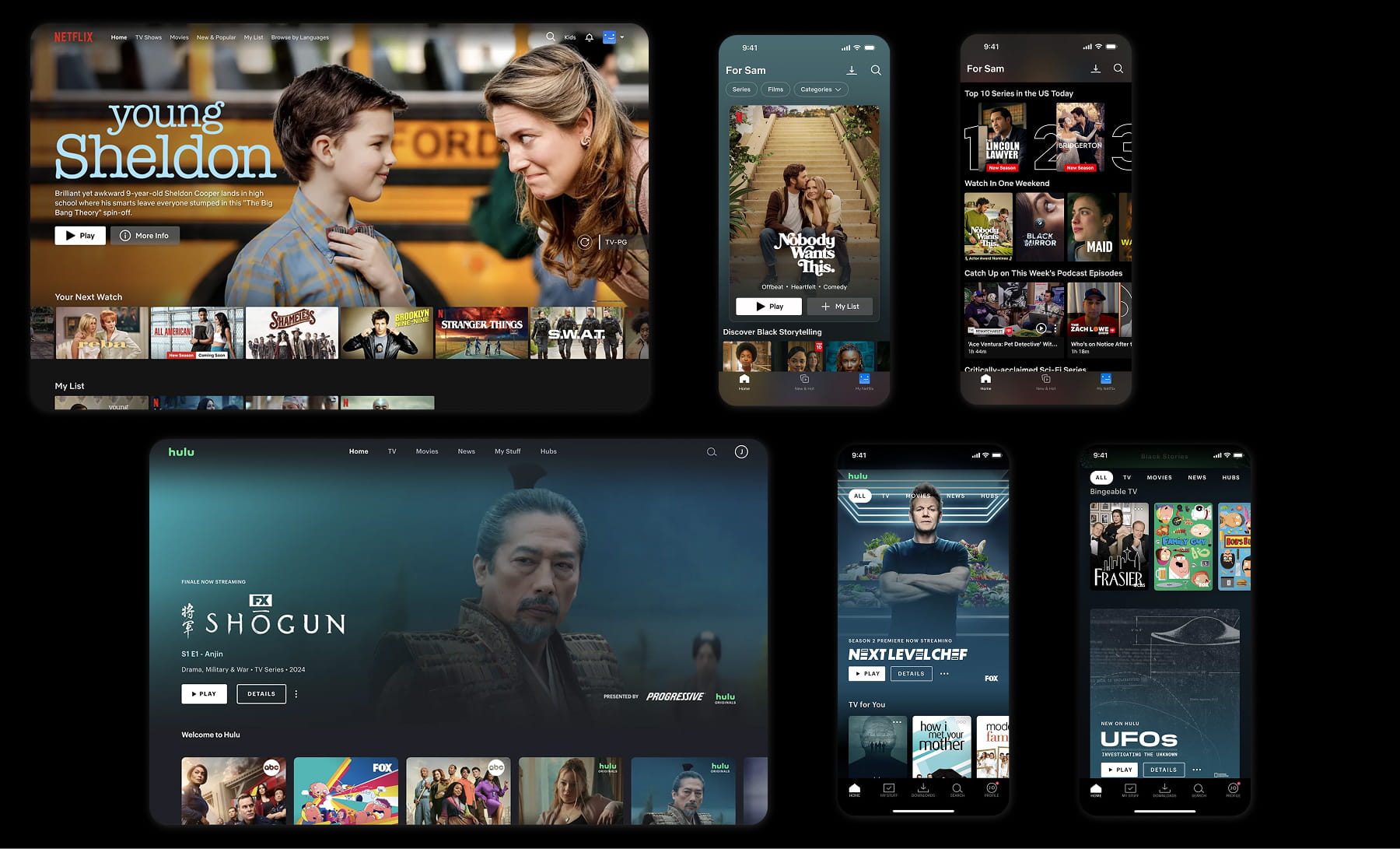
We ran user interviews alongside a competitive audit of global VOD benchmarks (Netflix, Hulu, BBC iPlayer) to pressure-test best practices, which validated a direction grounded in minimalist UI, a persistent top-nav for high-frequency destinations.
Frictionless flows for core tasks like registration, playlist curation, and show subscriptions. The end product needed to match the look, feel, and interaction patterns of a tier-one streaming platform signaling parity with the category leaders users were already benchmarking us against.
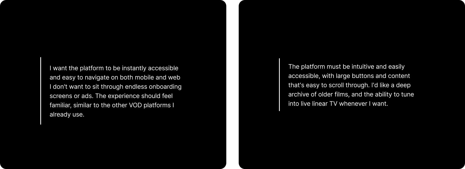
In parallel, we conducted internal stakeholder interviews with sports, entertainment, news, and archive to align on priorities and surface vertical-specific requirements.
Two key insights emerged: a dedicated "Live Sports" entry point in the top nav to capture high-intent traffic, and a horizontally scrollable Georgian archive rail to showcase the platform's deep, culturally significant back catalog.
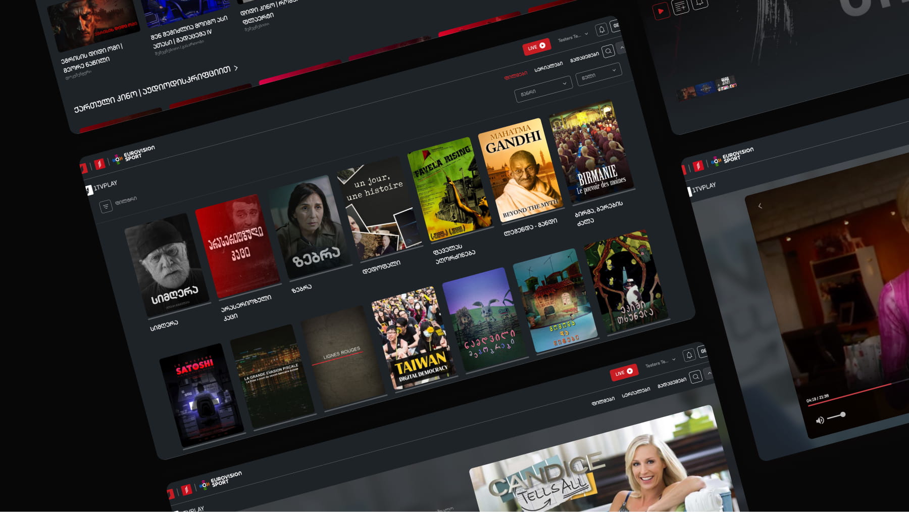
With research synthesized and a clear direction locked in, we moved into low-fidelity wireframing and usability validation before progressing to high-fidelity UI design. In parallel, we built out a comprehensive design system spanning web and mobile establishing scalable components, design tokens, and a single source of truth to streamline engineering handoff.

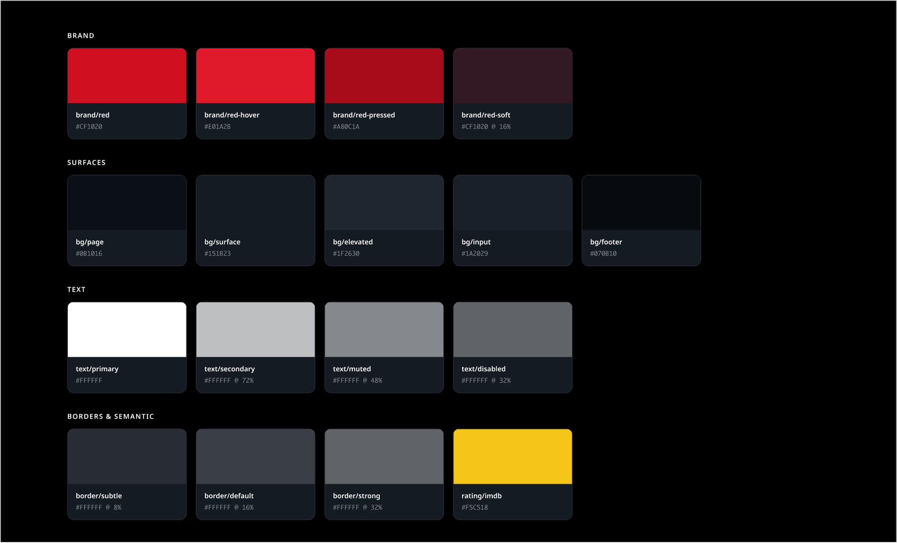
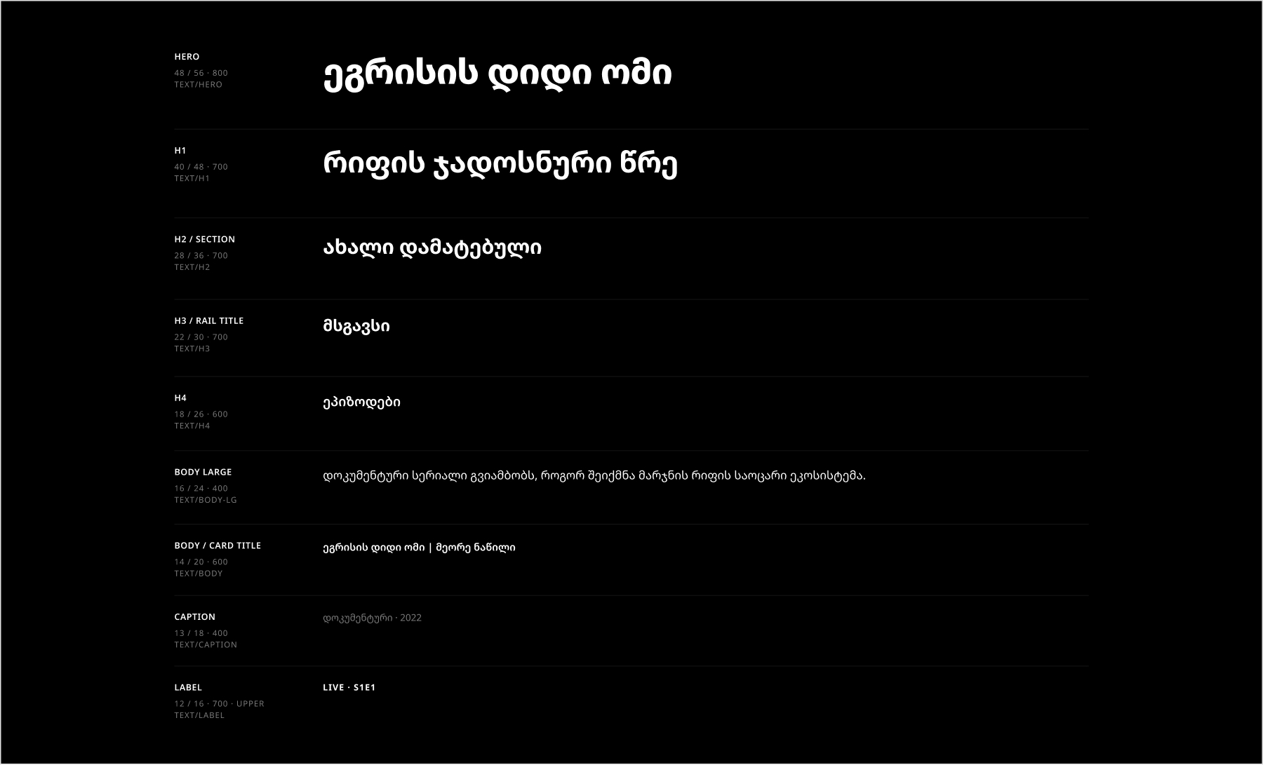
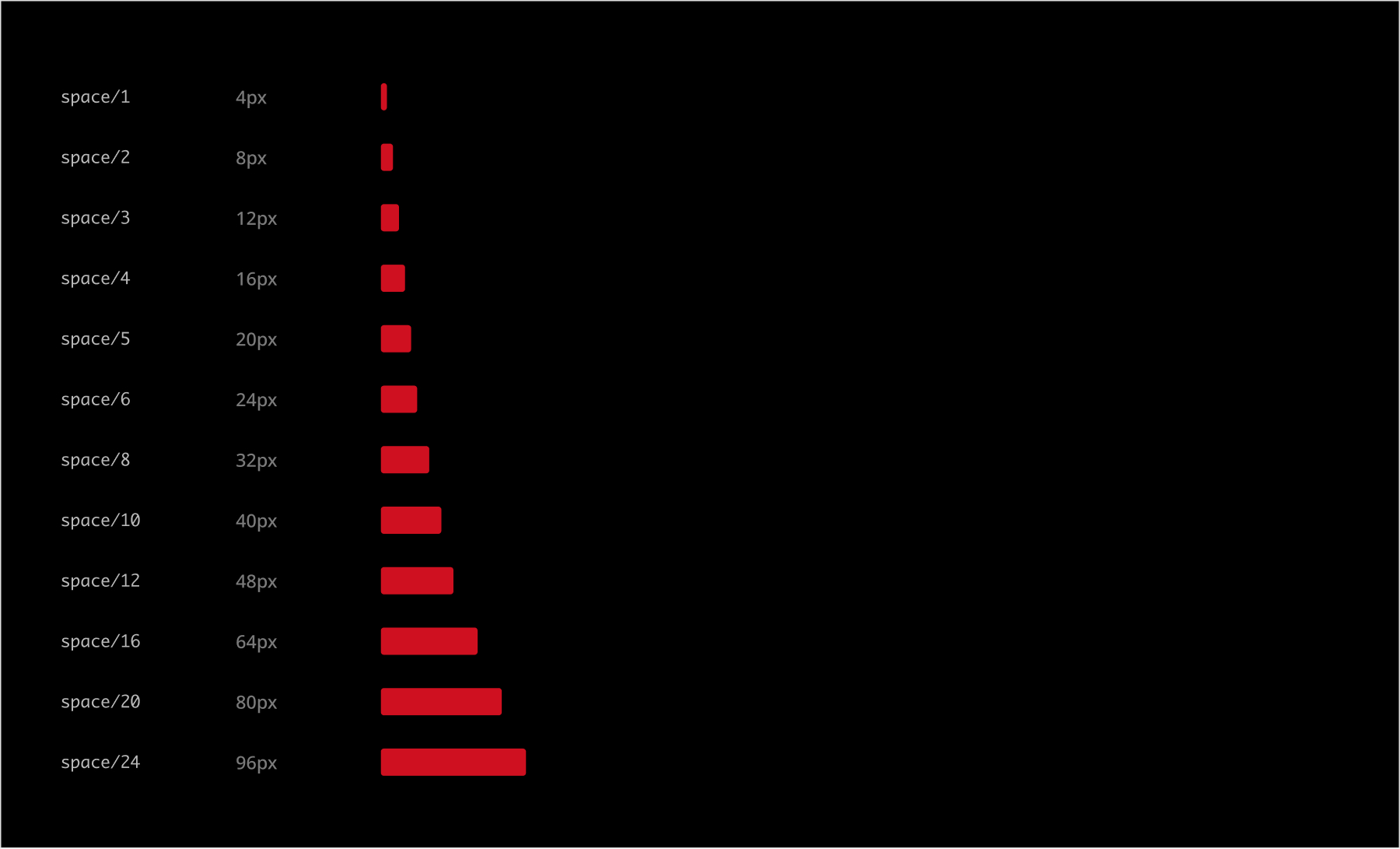
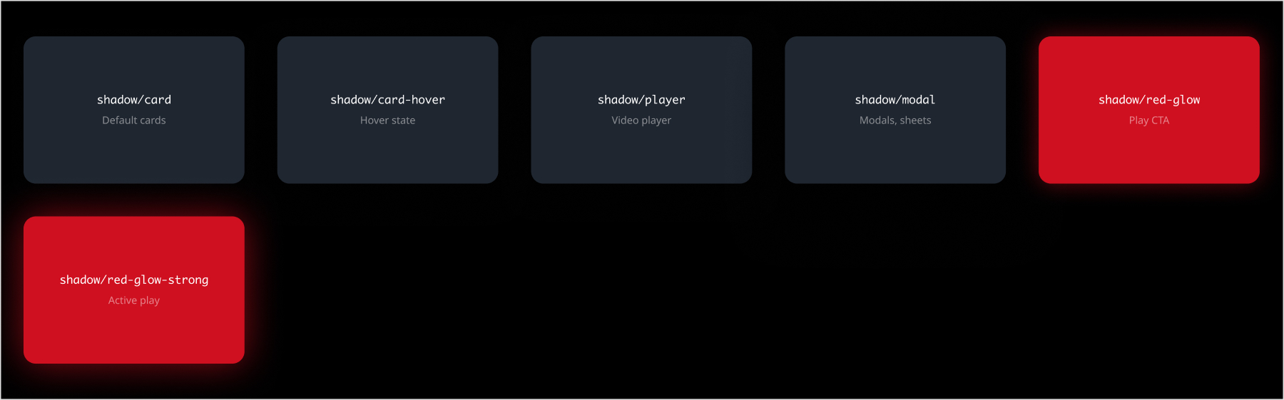


What's shown here is only a slice of the broader system both web and app were built off the same single source of truth. Owning a design system end-to-end has been one of the most valuable experiences in my career as a product designer, even ongoing maintenance and iteration is a substantial undertaking in its own right.
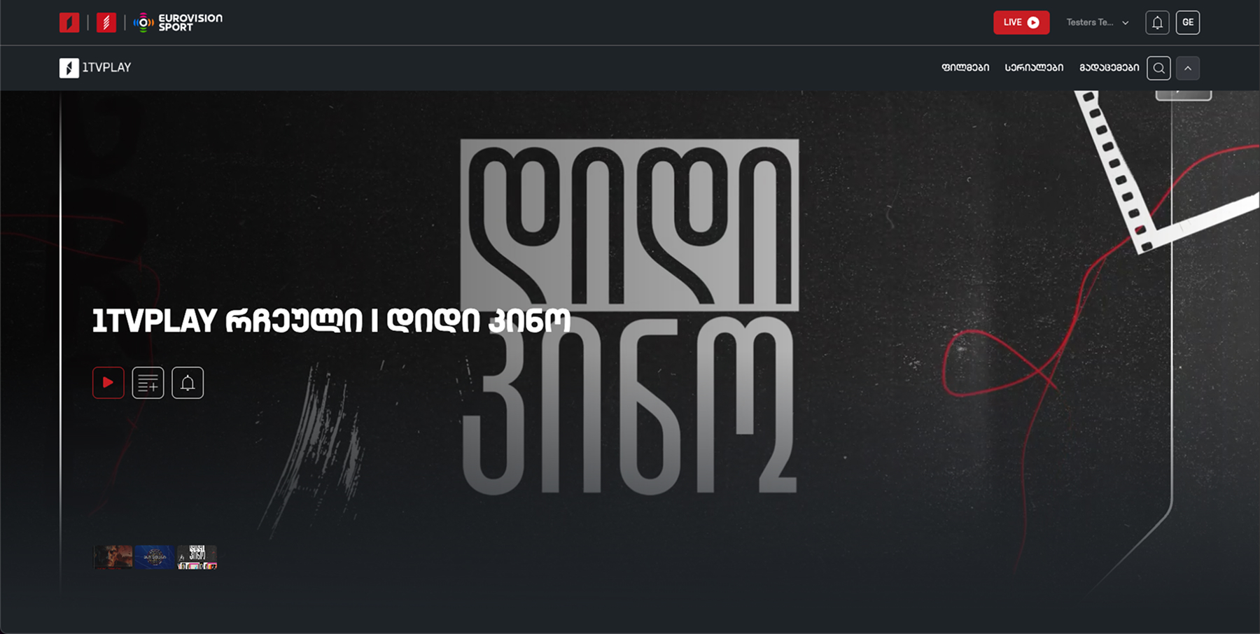
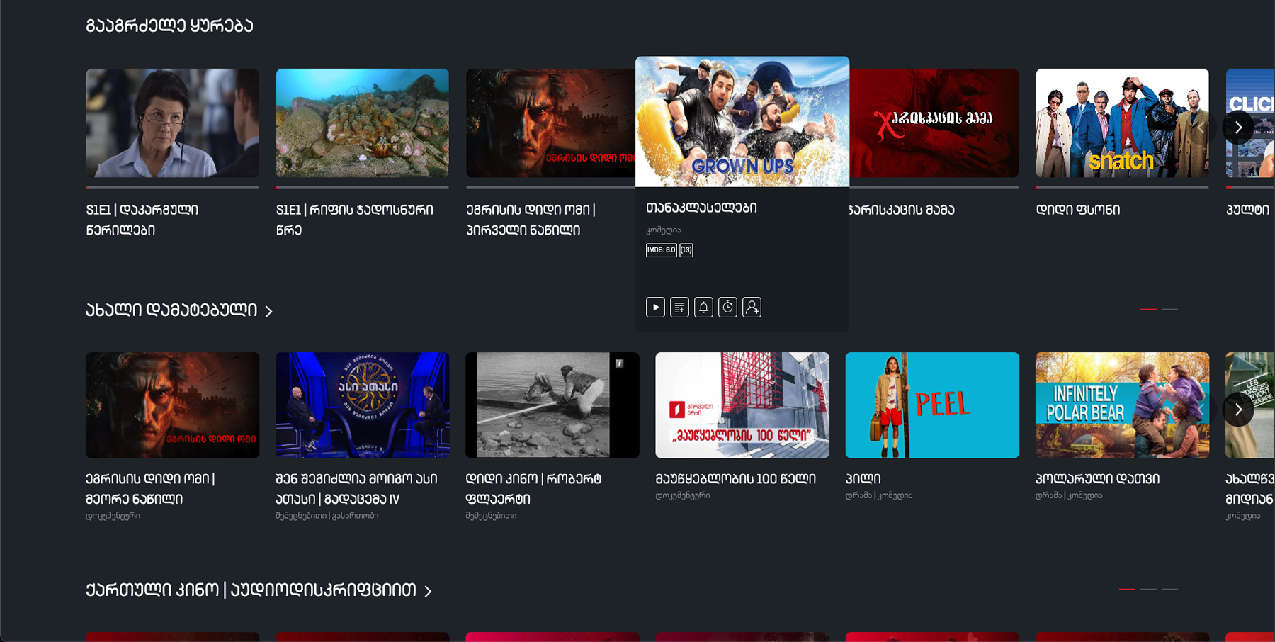
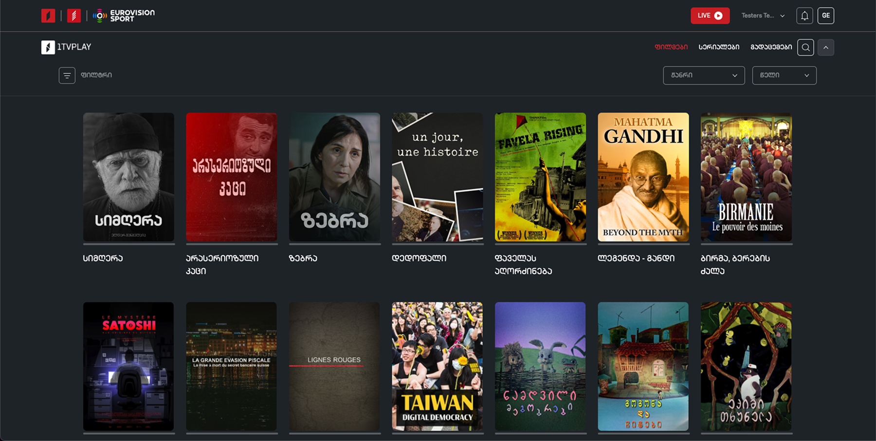

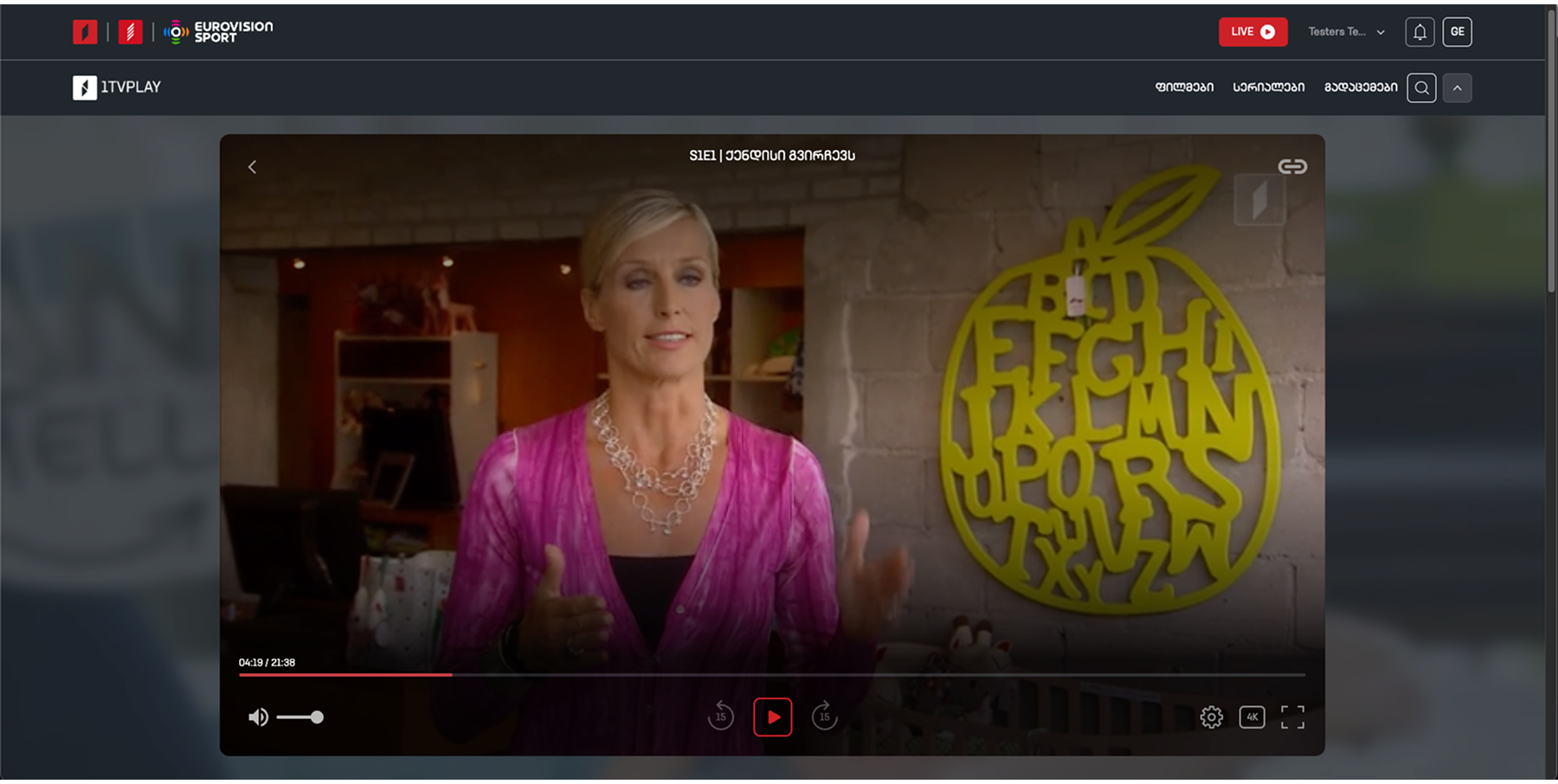
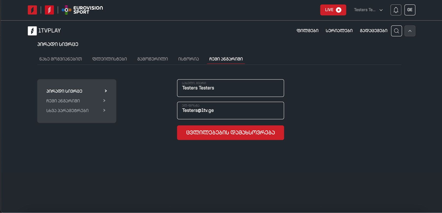
The site's structure was driven by industry best practices and research-backed insights. The top navigation bar remains persistent across the experience providing a clear wayfinding anchor and a low-friction exit path for older users while content cards and rails feature subtle motion and progress indicators, delivering the dynamic, responsive feel younger users expect from modern streaming platforms. The hero section is intentionally large and prominent, anchoring the landing experience with a clear focal point and guiding first-time users into the content hierarchy.
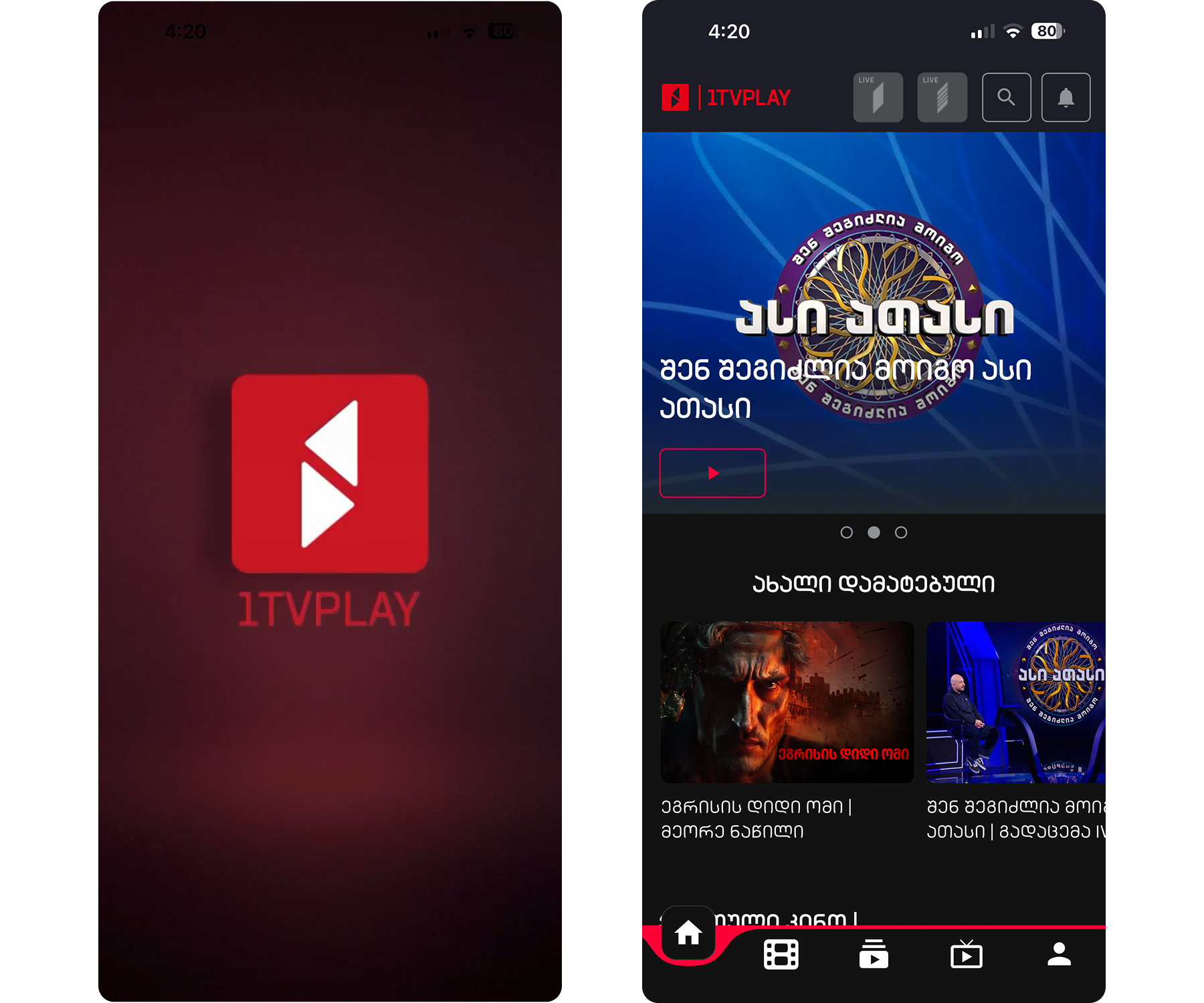
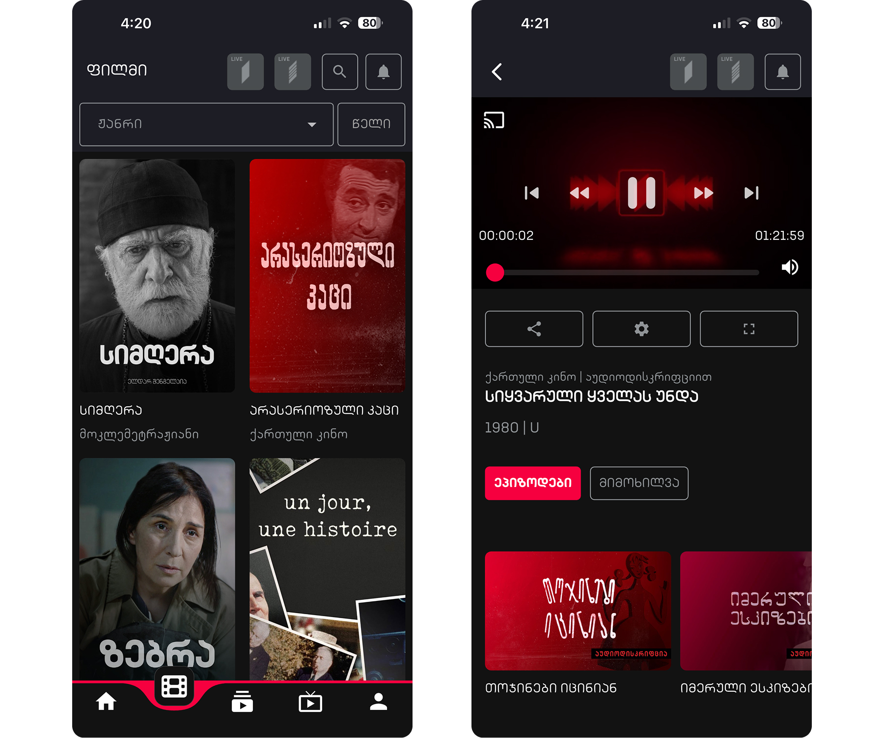
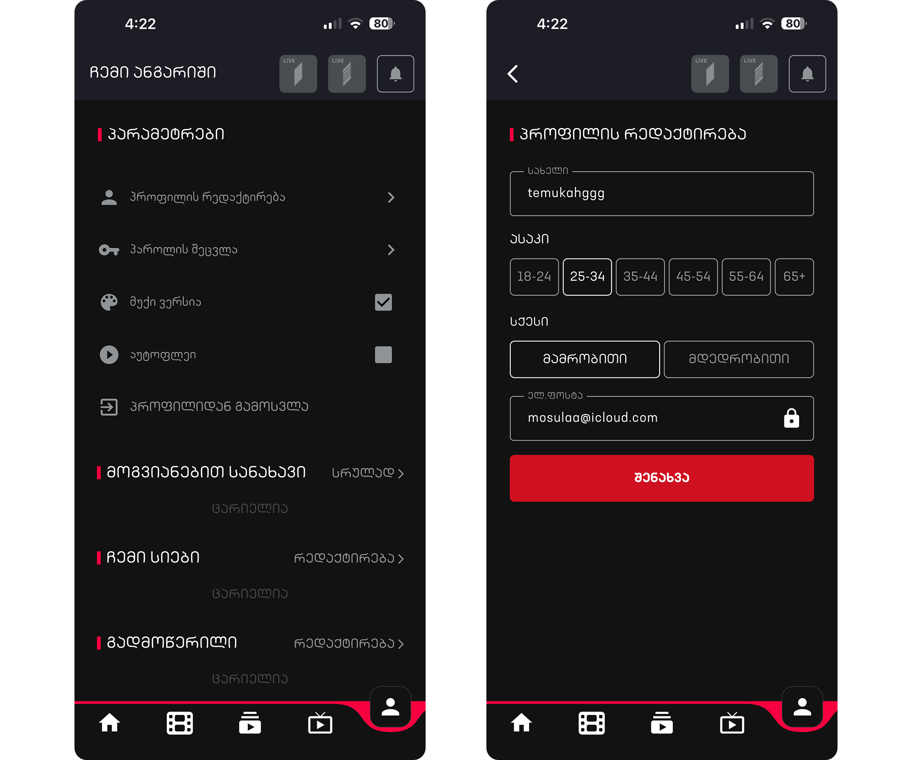
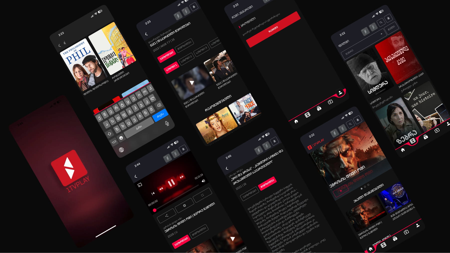
The mobile app followed the same design logic as the desktop experience large, thumb-friendly tap targets, a persistent top nav, and consistent component behavior across breakpoints. To surface real-time relevance, the top navigation animates in brand colors whenever a LIVE event is active, whether it's a sports broadcast or breaking news, creating an unmissable visual cue that drives users straight to time-sensitive content.
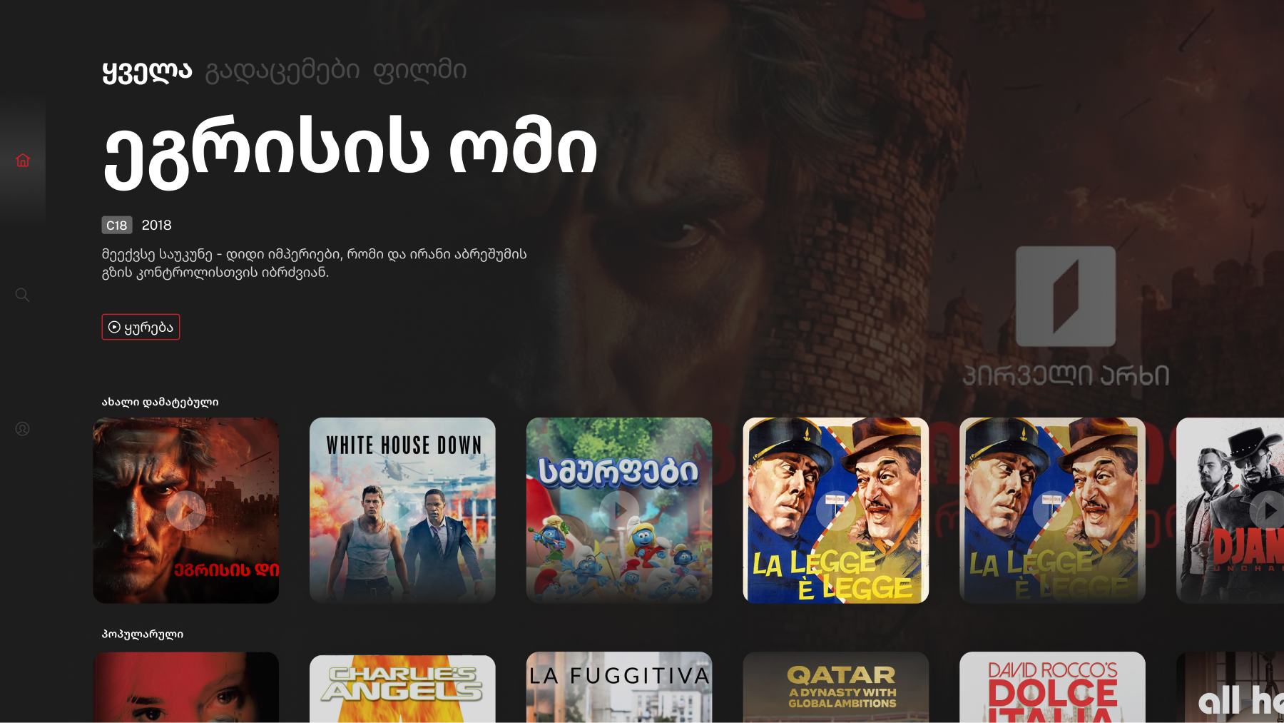
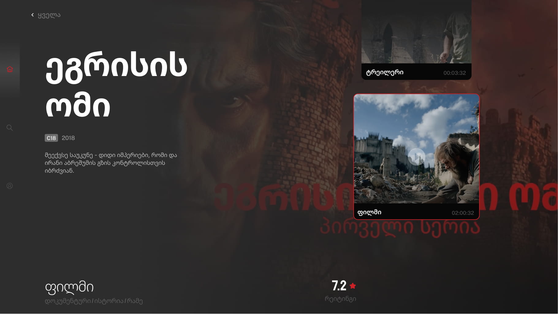
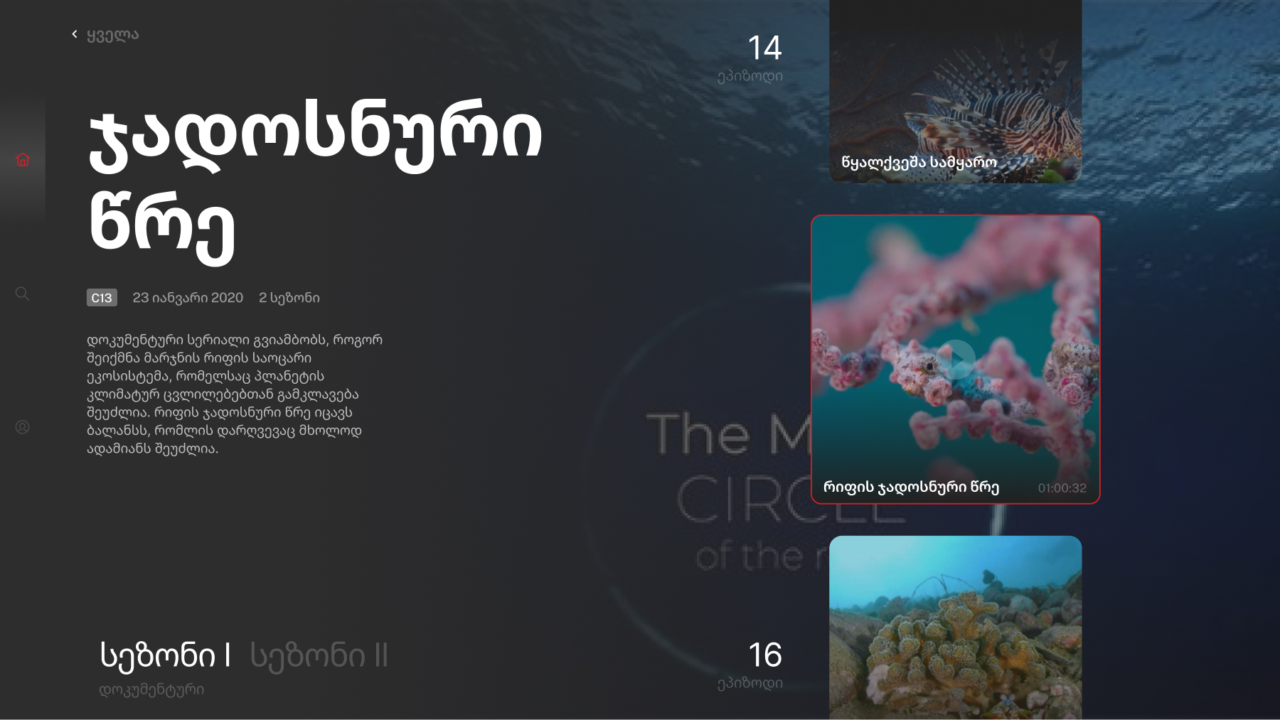
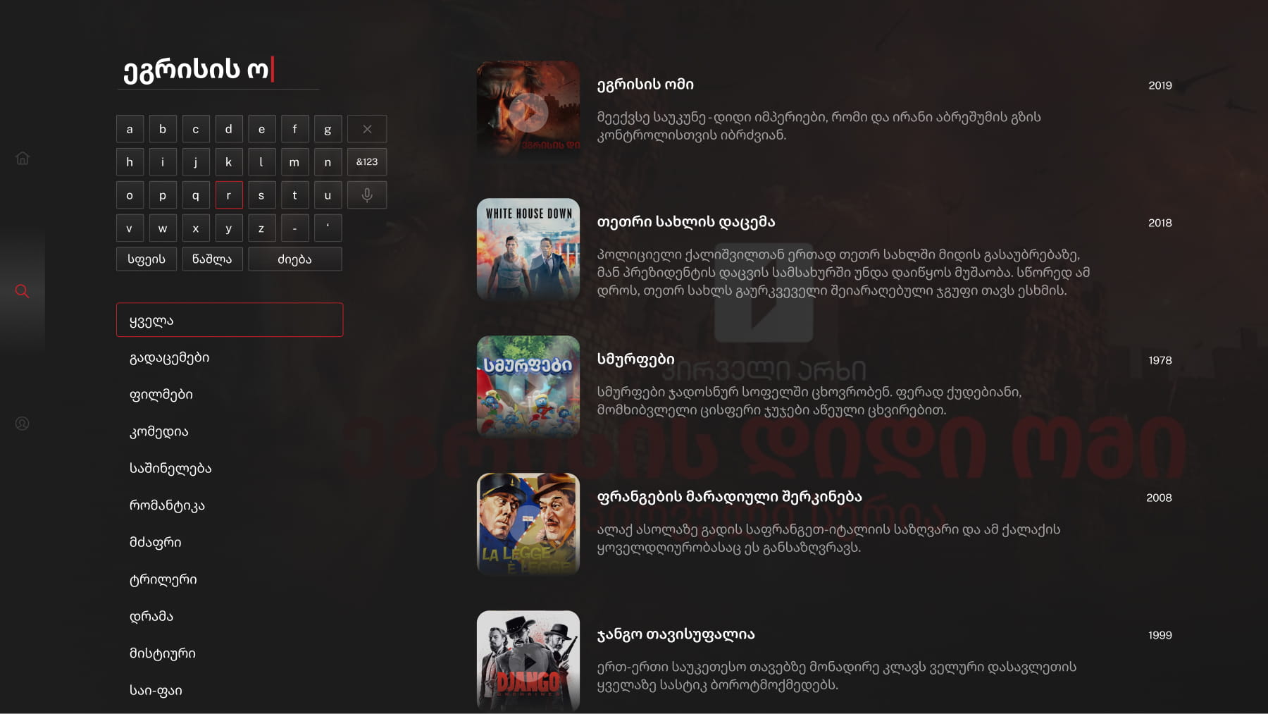
The organisation wanted to expand into the smart TV market, viewing it as a prestige milestone. I advised researching the market first, interviews and secondary research revealed that smart TV adoption in Georgia was low, so the project was postponed indefinitely. Still, I researched TV UI extensively and produced presentation mockups grounded in core smart TV principles 10-foot UI, focus-driven D-pad navigation, safe zones, and horizontal and vertical content rails.
1tvplay established Georgia's primary VOD platform across web and mobile, growing it to 445K users with an average daily engagement of 3h 34m a level of stickiness that shifted the broadcaster from a legacy TV operation into a digital-first content business.
The design system (42 components, 68 tokens) became the single source of truth across both surfaces, cutting handoff friction and locking in visual consistency between the website and app.
Beyond shipped product, the work drove strategic restraint where it mattered, a research backed recommendation against a smart TV launch saved the organisation from investing in a market that wasn't ready.
.jpg)